
CASE STUDY
Pinkpanda
A store rebuilt around what the tests said, and 42 landing pages behind it.
(01) INTRODUCTION
In ecommerce, visual polish alone does not drive growth. Pinkpanda came to us with a clear brief: get more out of the store they already had. They had an engaged audience and a recognisable brand, but the site was not converting at the level it could. There were friction points in the journey, dated design conventions, and messaging that changed from campaign to campaign.
What followed was a multi-phase collaboration built on experimentation. We rebuilt the store UI and designed and developed 42 custom landing pages, testing as we went rather than shipping a redesign and hoping.
(02) THE CLIENT
About Pinkpanda
Pinkpanda is a fast-growing beauty and wellness ecommerce brand based in Slovenia, selling cosmetics, skincare and personal care tools. Known for playful branding and competitive pricing, it attracts a primarily Gen Z and millennial audience.
In a crowded market, Pinkpanda differentiates with an influencer-savvy approach, curated bundles and limited-time offers. That growth is exactly what created the need for a more scalable, conversion-oriented store.
(03) CHALLENGES
Challenges
Visual clutter
Pages were overloaded with competing elements, inconsistent spacing and mixed messaging, which left customers with decision fatigue.
Low trust on product pages
Guarantees, reviews and delivery details were either buried or missing, so uncertainty showed up right at checkout.
Poor mobile usability
With a growing mobile audience, text overlapped, buttons were hard to hit and pages took too long to load.
No CRO strategy
No experimentation, no A/B testing and no real hierarchy of information. Pages that looked fine but did not sell.
Confusing navigation
Categories were not intuitive, filtering was weak, and customers got lost between offers, bundles and individual products.
(04) DISCOVERY
Discovery
- Heatmap and click analysis, which showed drop-offs around filter usage and checkout entry.
- User interviews, where people said they felt lost comparing similar products and lacked the confidence to finish the purchase.
- Competitor analysis, benchmarking against faster, cleaner DTC brands in the same category.
- A copy audit, which flagged inconsistent tone and missed chances to guide people through product benefits.
The insight: the brand had strong demand and poor guidance. The opportunity was not in adding more, it was in making clear what mattered most.
(05) THE VISUAL LANGUAGE
The visual language
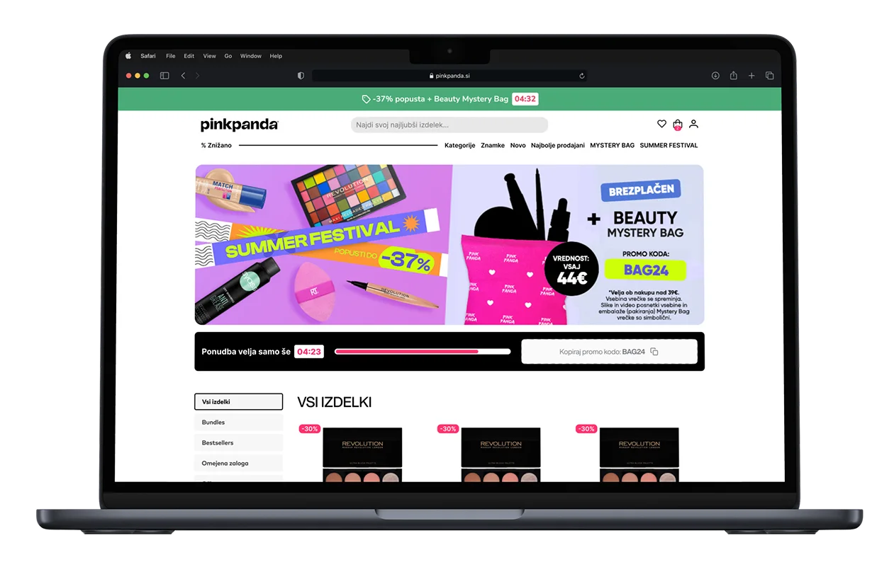
- Typography. Strong contrast between heading and body styles, for faster scanning.
- Colour. A limited palette, with emphasis colours held back for calls to action and promotions.
- Spacing. A clear grid and padding logic, to cut the visual noise.
- Modular components. Card layouts, badges and sticky banners, so a campaign page can be assembled rather than designed from scratch.
The result is a system where every page, whatever the campaign, feels coherent and unmistakably Pinkpanda.
(06) MESSAGING AND MICROCOPY
Messaging and microcopy
We used microcopy to build urgency without sounding like a sale, to make the value clear without adding clutter, and to keep the tone personal and fun, the way the brand actually sounds.
(07) NAVIGATION AND CALLS TO ACTION
Navigation and calls to action
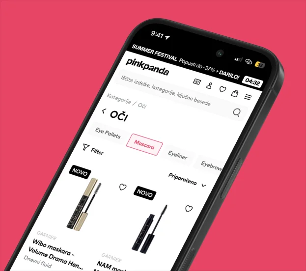
Navigation was rebuilt for clarity. Before, a dropdown mega menu with too many categories. After, five prioritised main categories with intent-based submenus.
- Homepage. A clear headline and a single call to action, rather than several competing ones.
- Landing pages. A floating CTA bar on mobile, with anchor-linked sections.
- Checkout. Reassurance copy and guarantee icons, at the point where people hesitate.
Mobile saw the biggest change, in navigation clarity and in how easy the buttons are to hit.
(08) HANDOVER AND BUILD
Handover and build
- Component documentation for the developers.
- Animation specs for hover states and sticky transitions.
- Responsive previews, so every breakpoint could be checked.
- Copy handover files, so campaigns can be edited without a designer.
We also worked directly with Pinkpanda's in-house developers on tracking scripts, event tagging and site speed.
Conversion Design nailed it. Top-tier designs, always on time, and a real understanding of what makes e-commerce convert. Their A/B test ideas and CRO know-how brought real results. Rare to find a team that gets both design and business.
(09) RESULTS
What changed
- Customers moved more smoothly through bundles and category pages.
- Landing pages consistently outperformed the old ones in A/B tests.
- Checkout friction was noticeably reduced on mobile.
- The brand reads as more premium and professional without losing its edge.
- Campaigns go live faster, because the pages are assembled from a system.
(10) YOUR TURN
Do you want a store like this?
If you’re thinking about building something similar, let’s talk. Tell us what you have in mind and we’ll help you figure out the best approach.
Not ready to reach out yet? No problem. You can start with a free audit and see what we find.