
Table of Contents
- Why Mobile Conversion Rates Lag Behind Desktop
- Step 1: Measure Your Current Mobile Conversion Performance
- Step 2: Ecommerce Mobile Site Speed Optimization
- Step 3: Mobile Checkout Optimization and Form Reduction
- Step 4: Design Thumb-Friendly Navigation and Tap Targets
- Step 5: Reducing Mobile Cart Abandonment Through UX
- Step 6: Test, Measure, and Iterate with A/B Testing
- Step 7: Post-Purchase Mobile Experience and Retention
- Frequently Asked Questions
Last Updated: September 25, 2026
Why Mobile Conversion Rates Lag Behind Desktop
Mobile traffic now drives the majority of online visits, yet conversion rates on mobile devices consistently underperform desktop. The problem runs deeper than just shrinking screen space.
To improve mobile conversion rates, you need a fundamentally different approach to user experience, checkout design, and page performance. Desktop strategies don't translate directly to smaller screens.
Teams typically optimize for desktop first, then squeeze the same experience onto mobile. That approach fails. Mobile users abandon carts faster, leave when pages load slowly, and struggle with forms designed for larger screens.
The good news? When you redesign specifically for mobile behavior, conversion rates improve dramatically. This guide walks you through a seven-step process to identify what's broken and fix it.
Step 1: Measure Your Current Mobile Conversion Performance
You can't improve what you don't measure. Start by understanding exactly where your mobile conversion rates stand today.
Pull your mobile vs. desktop conversion data from Google Analytics for the past 90 days. Calculate the gap, this shows your opportunity cost and revenue left on the table.
Segment your data by device type, traffic source, landing page, and cart abandonment rate. Most stores find mobile cart abandonment runs 10-15 percentage points higher than desktop, your biggest opportunity. Document your current mobile conversion rate as a baseline.
Step 2: Ecommerce Mobile Site Speed Optimization
Page load speed is the single biggest factor that can improve mobile conversion rates. Every 100ms delay in page load time correlates with a 1% drop in conversion rate on mobile.
Test your mobile page speed using Google's PageSpeed Insights tool. This gives you a mobile speed score and identifies your biggest performance issues. Also run tests in Google Search Console under the Core Web Vitals report to see real-world performance data from actual users visiting your site.
Common culprits: unoptimized images, render-blocking JavaScript, oversized CSS, slow server response times, third-party scripts loading before core content, uncompressed fonts, and missing lazy-loading.
Start with images: compress aggressively, serve different sizes using srcset and <picture>, and use WebP with PNG fallbacks. This often cuts page load time in half.
Defer non-critical JavaScript using defer or async attributes. Move tracking pixels and third-party widgets to load after the page is interactive.
Core Web Vitals and Mobile Performance Metrics
Google's Core Web Vitals, Largest Contentful Paint (LCP), First Input Delay (FID), and Cumulative Layout Shift (CLS), directly impact search rankings and conversion behavior.
Largest Contentful Paint (LCP) measures how long the largest content element takes to appear. Target under 2.5 seconds. Optimize by preloading critical images, minimizing server response time (TTFB under 600ms), eliminating render-blocking resources, and using a CDN.
First Input Delay (FID) measures page responsiveness to user interaction. Target under 100 milliseconds. Optimize by breaking JavaScript tasks into chunks under 50ms, using requestIdleCallback(), reducing bundle size, and considering Web Workers.
Cumulative Layout Shift (CLS) measures visual stability. Keep under 0.1. Set explicit dimensions for images and videos, reserve space for dynamic content, use font-display: swap for fonts, and use transform and opacity instead of layout properties.
If your theme scores below 50 on mobile in PageSpeed Insights, rebuilding or replacing it should be a priority. Test on staging before deploying.
Step 3: Mobile Checkout Optimization and Form Reduction
The checkout process is where mobile conversion fails most visibly. The fix: ask for less. Collect only what you absolutely need to process the order.
Most stores ask for seven fields. Cut it to four: email, address, city, postal code. Everything else can wait until after purchase or be inferred.
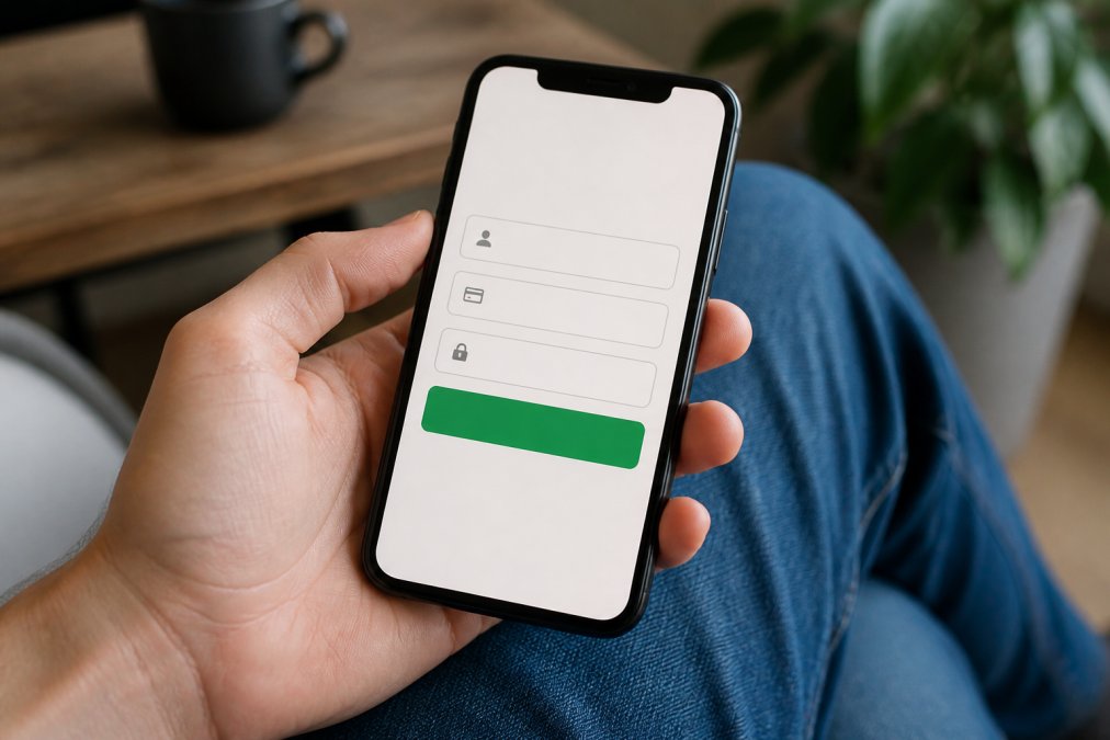
Simplify Input Fields and Enable Digital Wallets
Address fields are notorious friction points. Most sites ask for street address in one field, then city, postal code, and country in separate fields. That's four fields for one piece of information.
Use address autocomplete instead. Google Places API or similar services let users type their address once and select from a dropdown. One field instead of four.
Enable digital wallets. Apple Pay, Google Pay, and PayPal eliminate the need for manual payment entry. On mobile, digital wallets convert 15-20% higher than traditional card entry. They're faster, more secure, and familiar to users.
If you're not offering digital wallets on mobile, you're leaving conversion on the table.
Step 4: Design Thumb-Friendly Navigation and Tap Targets
Mobile users navigate with their thumbs. Design your interface around thumb reach, not cursor precision.
The "thumb zone" on a phone is the lower two-thirds of the screen. Buttons, navigation, and key calls to action should live here. Buttons at the top of the screen require reaching, users will avoid tapping them.
Make tap targets large. A button should be at least 44 pixels tall and 44 pixels wide. Smaller buttons get misclicked. Misclicks frustrate users and reduce conversion.
Space buttons apart. If two buttons sit too close, users tap the wrong one. Leave at least 8-10 pixels of space between interactive elements.
Simplify your navigation menu.
Step 5: Reducing Mobile Cart Abandonment Through UX
Cart abandonment on mobile happens for specific reasons. Address them directly.
Step 6: Test, Measure, and Iterate with A/B Testing
Improvement comes from testing, not guessing. Set up A/B tests to validate your changes before rolling them out.
Step 7: Post-Purchase Mobile Experience and Retention
Most teams focus entirely on getting the initial conversion. Then they ignore the customer. This is a critical mistake: your post-purchase mobile experience directly impacts whether that customer buys again, and repeat customers have 5x higher lifetime value than first-time buyers.
Order Confirmation and Immediate Reassurance
Send order confirmation immediately, within 5 minutes of purchase. Most users read this email on their phone. Make it mobile-first.
Include:
- Order number (large, easy to copy)
- Expected delivery date or timeframe
- Direct tracking link (clickable, not a URL they have to copy)
- Clear next steps ("Your order will ship within 24 hours")
- Easy return instructions or link to return policy
- Customer service contact (phone number, email, chat link)
Test this email on actual mobile devices. Check that:
- Text is readable without zooming
- Buttons are at least 44px tall and wide
- Links are tappable without accidental clicks on nearby elements
- Images load and display correctly
- The email renders properly in Gmail, Apple Mail, and Outlook (test across all three)
Proactive Shipping Updates and Delivery Notifications
Don't wait for customers to check their order status. Push updates to them.
Mobile-Optimized Returns and Issue Resolution
A complex return process on a small screen frustrates users and drives them to competitors. Simplify it.
Make returns accessible from a mobile-friendly order history page. Users should be able to:
- View past orders with one tap
- Request a return with two taps
- Print a return label (or receive it via email with a direct link)
- Track the return shipment
Post-Delivery Feedback and Repeat Purchase Triggers
Send a simple survey 3-5 days after delivery. One question, not ten: "How satisfied are you with your purchase?" with a 1-5 scale. Mobile-optimized surveys take 10 seconds to complete.
Use their feedback:
- 5-star ratings: ask them to leave a review, offer a discount code for their next purchase
- 3-4 star ratings: ask what could be improved, offer a small discount to encourage repeat purchase
- 1-2 star ratings: trigger immediate support outreach to resolve the issue
Measuring Post-Purchase Mobile Impact on Conversion
Track these metrics to understand how post-purchase mobile experience drives repeat purchases:
- Repeat purchase rate (customers who buy more than once)
- Time between first and second purchase
- Average order value on repeat purchases vs. first purchases
- Customer lifetime value by cohort (customers who received proactive updates vs. those who didn't)
- Return/refund rate (high returns indicate post-purchase dissatisfaction)
- Support ticket volume related to order status (high volume indicates poor post-purchase communication)
Segment your data by traffic source and device type. You may find that mobile customers have different repeat purchase behavior than desktop customers. Use this insight to optimize your post-purchase strategy.
Frequently Asked Questions
What is a good mobile conversion rate for e-commerce?
Mobile conversion rates vary by industry and traffic source, but most e-commerce stores see 1-3% on mobile, compared to 2-4% on desktop. The gap exists because mobile users face slower load times, smaller screens, and awkward form interactions. Benchmark against your own historical performance and competitors in your vertical rather than chasing a generic target. Focus on improving your mobile conversion rate relative to your baseline.
How does page speed impact mobile conversion rates?
Page speed directly affects bounce rate and conversion. A one-second delay in mobile load time can reduce conversions by 7% or more. Slow pages frustrate users on mobile networks and increase abandonment before checkout even begins. Ecommerce mobile site speed optimization includes compressing images, minifying code, enabling caching, and using a content delivery network. Test your Core Web Vitals regularly to ensure pages load in under 3 seconds on 4G.
What are the most common mobile UX friction points in checkout?
The biggest friction points in mobile checkout optimization include too many form fields, unclear call-to-action buttons, lack of digital wallet options (Apple Pay, Google Pay), unexpected costs revealed late, and forced account creation. Each extra input field increases cart abandonment. Simplify your checkout to essentials: email, shipping address, and payment method. Enable one-click payment and show total cost upfront to reduce surprises and drop-off.
Why should I invest in mobile conversion optimization if my traffic is still mostly desktop?
Mobile traffic is growing faster than desktop in most markets, and mobile users are increasingly comfortable purchasing on their phones. Even if your current mobile traffic is 30% of total, that segment is likely your highest-growth channel. Improving mobile conversion rates compounds: as mobile traffic grows, the revenue impact multiplies. Start optimizing now rather than waiting until mobile becomes your majority, your competitors are already moving.